The Espresso Book Machine prints complete paperback books at rates up to one every sixty seconds – complete interior pages in black and white with full color, perfect bound covers. You can even see it in action.
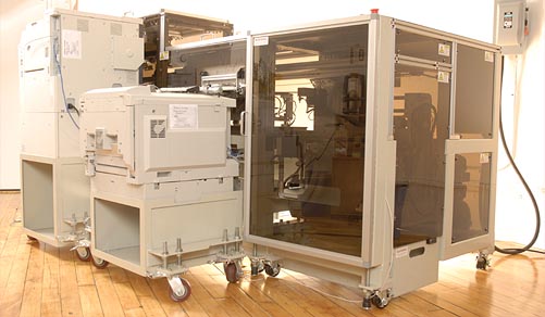
At a million dollars apiece I doubt that you or I will be setting one up in the basement. The machines are intended for use by libraries and retailers, who can offer inexpensive but commercial quality books to you, on demand. Because there are already large collections of public domain digital books – more all the time – it’s possible that in the future no book will ever need to be unavailable. “Out of print” may become a meaningless phrase.
Machines are already in place at the library of Alexandria in Egypt (nice touch!) and in Washington DC, at the World Bank InfoShop. Another has just been installed at the New York Public Library’s Science, Industry and Business Library. More are headed to libraries in New Orleans, San Francisco, and other cities in the U.S. and Canada.
Libraries – like bookstores – have limited shelf space. And although it goes against my own idea of what a library should be, they commonly discard books that aren’t popular. A system like this one can ensure that books can be made available even if they’re not kept on the shelves.
On the commercial side, a bookstore could use these machines to produce public domain books on demand and even copyrighted books, under license, so that any book could potentially be available at any time. It’s a pretty exciting thing.
This reminds me of an idea I had about fifteen years ago – although that thought was about clothes, not books. If a retailer had a large selection of patterns available and a 3D scanner you could walk into a shop, have your body scanned, and pick the clothing style and material you wanted. Tailor-fit clothes could be then made for you at a nearby – or distant – workshop. No kind of clothing would ever have to be unavailable, and anything you bought would fit you perfectly. You could get a pair of custom fit khakis and a nineteenth century frock coat at the same place, at the same time. I’m still waiting for that one.
But when it comes to the books, anyway, I think this is a terrific development. The only snag I can foresee is that in the decades to come, any book that’s been published in electronic form with DRM may not be easily reproduced even after it falls into the public domain – because DRM, unlike copyright, is forever.
This entry was posted on Tuesday, July 31st, 2007
and was filed under Print On Demand
There have been no responses »
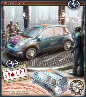
Heres‘ my entry – possibly my first entry – in the “Skin a Scion” contest at Deviant Art.
True to form, I ended up skinning the world around the car, too. Win or lose, I think I’ll end up retooling the scene after the contest, with one of my own vehicles. Something you’d expect to see coming out of the Retropolis Rocket Works.
This entry was posted on Sunday, July 29th, 2007
and was filed under Computer Graphics, Works in Progress
There has been 1 Response »
 I’ve always loved books, and I do mean always; I learned to read at such an early age that I can’t remember doing it, or a time when I couldn’t read. That’s very different from the way I learned to talk, but trust me – that’s another story.
In fact when I was young I always believed that I was going to be a writer. It just didn’t work out that way.
I started using traditional Celtic knotwork designs in my drawings and paintings back in 1980. During the 80s I continued that and eventually began to invent new patterns of my own. Then at some point in the early 90’s, I stopped. I think it was because I was getting so typecast as “the Celtic Art Guy” that it was annoying, and I figured I ought to show my chops in some other kind of art. But also, I probably wanted to explore something a bit different just to suit myself.
(more…)
This entry was posted on Saturday, July 28th, 2007
and was filed under Print On Demand, Works in Progress
There have been no responses »
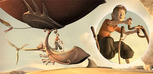
“Stilt Walkers” is a beautiful, four minute student film by Alexis van der Haeghe of Belgium. It reminds me of those old days when I’d zoom across California in my art nouveau airship, investigating the clouds and having adventures. Except that I didn’t do that, of course.  But watching this boy have his own adventures sure makes me wish I had, and I almost feel like I did.
Clad in an aviator’s helmet and plus-fours, the boy is clearly having the time of his life until he encounters a pair of comedia-del-arte style giants on towering stilts. Complications ensue, all in fine style. Highly recommended.
The artist has since done some work on a movie trailer and a CD, but seems to be working away, at the moment, on a children’s book. A personal project – glad to see that. I’m always interested in what we can do when we’re not bound by what someone else thinks they can profit from.
This entry was posted on Wednesday, July 25th, 2007
and was filed under Computer Graphics, Found on the Web
There have been no responses »
 All right, first things first. Why the heck would you want to put your DNA in a necklace?
1. A gift for your spouse so that he/she/it can clone you, if things go badly at the office tomorrow.
2. A chance to sprinkle your own DNA very far away from the crime scene. In a way that conclusively proves you weren’t there at the relevant time.
3. A little memory aid, just in case you experience a vacant moment in the middle of reciting your chromosome pairs. If this is you, please don’t come to that party on Saturday.
 Or.. something. Anyway, since we’ve established your motive (you can tell that I’m all about the second reason) the vampirewear.com web site offers you detailed and, for all I know, accurate instructions on how to sample, isolate and contain your own DNA – all so they can sell you a stylish vial to keep it in. See? Stylin’.
This nugget of academic dementia was thrown through the Secret Laboratory’s skylight by Jean Roth.
This entry was posted on Monday, July 23rd, 2007
and was filed under Found on the Web
There have been no responses »
I thought I was pretty well acquainted with the major early 20th century industrial designers – like Norman Bel Geddes , Raymond Loewy
 , and Henry Dreyfuss
 – until I was talking about them one day with an artist on my (then) team. He’d come from Wisconsin, where he’d studied at Brooks Stevens’ school and later worked at his firm. Stevens himself wasn’t working any more, but he still turned up from time to time. So I did a bit of homework. Which at last led me to this book.

And sure enough, I already knew the man’s work even though I had known nothing about him. Stevens, like those other designers I mentioned, cut his designer’s teeth during the futuristic 1930’s – and like them, he was able to turn his hand to just about anything that was manufactured, from cars to trains to boats to kitchen appliances.
Like Dreyfuss, he was an eminently practical man when it came to product design. But Stevens also had an innate grasp of how people would be affected by the objects he designed. A perfect example of that is the fact that it was Stevens who put a window in a clothes dryer. What had been a featureless cabinet suddenly became animated, hypnotic; the dryers were styled very much like early televisions and in showrooms across the country people just stopped and… watched them. That one decision shows a pointed insight into the way we respond to objects.
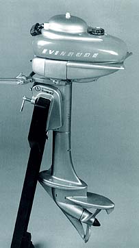 Through his long association with Evinrude, Stevens defined for us what an outboard motor should look like. He often took ungainly machines with jagged, mechanical profiles and streamlined them in casings – just the way designers were encasing steam engines in rocket-shaped, teardrop shells. Likewise he worked for many years for Studebaker, and – not to neglect the the ridiculous – he reinvented Oscar Mayer’s Wienermobile.
Yet one of his best remembered legacies of the 1950’s is his invention of the phrase “planned obsolescence”. He saw this as “instilling in the buyer the desire to own something a little newer, a little better, a little sooner than is necessary.” That’s far from the most sinister application of the phrase – which is to design products so that they will intentionally wear out within a certain timeframe, so that the buyer has no choice but to buy again.
 Even in its more aboveboard meaning there’s a kind of manipulation in the idea that doesn’t sit well with us. But in the past three decades industries have gone far beyond this, with the scheduled introduction of incompatible hardware, data formats, and operating systems, so that we are expected to buy the same content again and again to work on these new devices – especially where the older ones are no longer available. Steven’s phrase and intent seem somehow innocent, at this stage.
This handsome book gives us many examples of Stevens’ designs from every period from the 1930s to the late 1970s, and a good deal of insight into the ideas and client relationships that lay behind those designs.
One of the things that pleases me about these designers is the total world canvas they were able to paint. In the late 20th century industries became more and more specialized. But in the century’s early days it was more than ever possible to be a generalist – in any field, not just in design – and the overall style of the period makes their collective work somehow hang together, like the inevitable result of ongoing progress. It’s a fascinating period to study, and – maybe – to envy, just a little.
This entry was posted on Saturday, July 21st, 2007
and was filed under Reading / Watching / Consuming
There have been 2 Responses »

This is a test rendering of a natural landscape which I rendered in 3DS Max 8. The terrain’s from a height map I generated with the free version of World Machine. This height map became a Displacement map in 3DS Max.
I’ve written up a tutorial on how I created the height map (in World Machine) and turned it into a textured 3D landscape using 3DS Max. You can read the whole review/tutorial here.
This entry was posted on Wednesday, July 18th, 2007
and was filed under Computer Graphics, Works in Progress
There have been 3 Responses »
I must have started thinking about Saga Shirts in early 2005, though it might have been a bit earlier. There were two things that combined to make it happen.
 First, I’d been very happy with my print-on-demand web sites like “Celtic Art & Retro-Futuristic Design” and “The Retrovert“. But one problem with print-on-demand (at least then) was that there was no way to get good quality printing on black or dark colored shirts. I was asked for black shirts more often than anything else, I think. There just wasn’t any way to offer them that I felt good about selling, through a print on demand service; you still really needed to go with traditional silk screen printing.
(more…)
This entry was posted on Tuesday, July 17th, 2007
and was filed under Print On Demand, Works in Progress
There have been no responses »
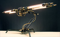
Frank Buchwald’s gallery for his series of “Machine Lights” sculptures is either a collection of what I’d like to install at the Secret Laboratory, or maybe a collection of things I wish I’d designed myself.
 Some of these look like something that crept out of Tesla’s brain, while others are more the sort of Buck Rogers chic that I hope is my own province.These are artfully made objects, certainly not toys – spend some time with those detail shots to see just what Buchwald’s up to here. There are hand-blown glass bulbs and tubes, and individually machined and finished parts in steel and brass.
I just love the demented craftsmanship in these. The lights are available in limited numbers, but as far as I can tell there’s no pricing information available unless you contact the artist. I’ve got a feeling they’ll be beyond my means unless this ATM-Dispersal Ray I’m tinkering with works out. But by all means – go look!
This entry was posted on Saturday, July 14th, 2007
and was filed under Found on the Web
There has been 1 Response »
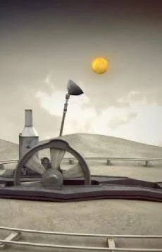
“Solar“, by Ian Wharton and Edward Shires, is a short animated film that shows us just how badly things may go wrong even in a universe that runs on sustainable, low technology mechanics. Well. That’s sort of what it shows us.
 Fortunately even low tech cosmology has some built in safeguards.
The two artists behind the film recently graduated from the Cumbria Institute of the Arts, where their film took a best-of-show award. It’s got a lovely paynes’ grey and sepia palette for its steampunkish clockwork universe, and it’s easy to see why it won in competition.
This entry was posted on Thursday, July 12th, 2007
and was filed under Computer Graphics, Found on the Web
There have been no responses »




 Through his long association with Evinrude, Stevens defined for us what an outboard motor should look like. He often took ungainly machines with jagged, mechanical profiles and streamlined them in casings – just the way designers were encasing steam engines in rocket-shaped, teardrop shells. Likewise he worked for many years for Studebaker, and – not to neglect the the ridiculous – he reinvented Oscar Mayer’s Wienermobile.
 Even in its more aboveboard meaning there’s a kind of manipulation in the idea that doesn’t sit well with us. But in the past three decades industries have gone far beyond this, with the scheduled introduction of incompatible hardware, data formats, and operating systems, so that we are expected to buy the same content again and again to work on these new devices – especially where the older ones are no longer available. Steven’s phrase and intent seem somehow innocent, at this stage.


 First, I’d been very happy with my print-on-demand web sites like “


