
 A new page has been published in the story The Lair of the Clockwork Book, at Thrilling Tales of the Downright Unusual.
You can read it here.


 A new page has been published in the story The Lair of the Clockwork Book, at Thrilling Tales of the Downright Unusual.

So here’s how I figure this happened. Terriers were working dogs, once upon a time: the well-equipped rat catcher would go out with his dogs and ferrets, which brings the Steeleye Span recording to mind, and between them those little (but fierce) hunters would flush out and dispose of all the rats they could find.
But what were they to do once they’d all gotten rocket ships? Apparently, they decided to play tag until the space rats showed up.
This is a pair of prints by Brian Rubenacker, at Etsy; and if rocket-riding terriers are just the tip of your iceberg, you’ll be happy to know that the same is true over there. Related: another Boston Terrier in an aviator’s helmet.

 A new page has been published in the story The Lair of the Clockwork Book, at Thrilling Tales of the Downright Unusual.

Doctor Professor’s Thesis of Evil is a motion graphics film project that’s the brainchild of a group of mad Finns in a far-northern town that (they tell us) you’d never even find on a map.
It’s the story of a super villain who’s found that super villainy, these days, is more a matter of public relations and media exposure than of the kind of full bore, absolute evil that he was after when he started his career. Evil’s become just another media event: you can imagine his disappointment in this world that bristles with death rays, giant mutant koala bears, and superheroes.
The filmmakers started with a low budget and they’ve made some interesting choices when it comes to figuring out how to get the best quality with their limited resources. It’s (predictably) a combination of live actor photography with CGI… but in order to get the highest quality assets for their production they’ve taken an unusual route that combines very good still photography, computer animation, and the kind of motion graphics techniques you’d more often find in title sequences for television and film.
The result is more striking than you might expect. Since their actor photography is all based on stills they’ve been able to deliver very nice lighting, and they’ve spared no effort when it comes to the costumes and makeup. That still photography is combined with the rendered CGI with pans, zooms and other camera effects that deliver an interesting sense of motion even though the actual motion of the characters is pretty limited. You can get a taste of this with their teaser, and see a bit more about the production at their IndieGoGo fundraising page.
That fundraiser has – as I write this – just 16 hours to go, and they’re currently a ways off from the $8000 goal they’ve set to complete the sound design and post-production for the film. So, you know, they could use a hand over there.

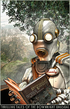 Sommer Leigh has written a pretty thorough description of the retro futurist genres that (mostly) end in the suffix "punk".
I’ve said before that I’m not all that crazy about labels of this kind, and it’s partly because apart from the first of these – cyberpunk – the punk suffix is completely meaningless.
In William Gibson’s Neuromancer
and in at least its first descendants, "punk" really did belong in the name. The technological marvels of these futures were not there to benefit people. They were there to cement the power of large corporations and organizations. The fact that a disenfranchised few on society’s fringes were able to subvert those technologies to their own ends is what made them punks, in the punk rock sense. They were standing on its head the mechanism of power and making something personal and subversive out of it.
But then the word became popular, and shortly afterward it became meaningless, as we see in all the labels that have followed.
Leigh touches on this in her description of steampunk, which is nice to see. Heck, it’s always nice to see people thinking about the meanings of the words they use.
Apart from my own crotchety observations, then, Sommer Leigh has come up with short form descriptions of what each of these labels gets stuck on which should be useful to anybody who wants to use them. (Did I say I was done being crotchety? Oh well. And get off my lawn, there, you kids!)
Consider it a field guide to spotting these words when they’re thrown around in the wild. There are some nice examples cited except, oddly, for the one label I rather like. That’s "Raygun Gothic". Why do I forgive that particular label? First off, there’s no meaningless suffix – what a relief! But despite that, if you take a good look at it "Raygun Gothic" doesn’t seem to mean much, either. It’s just such a… pretty phrase, I guess, and sort of evocative, so I find myself smiling at it even though it, too, seems to be playing on my lawn.

 |
 |
|
| Space Piracy: Career for the Future! |
Sword of Light (An Claidheamh Soluis) |
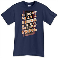 It’s another one of those computationally intensive discounts that varies from item to item. On a dark colored shirt you’ll get about 17% off; on a light colored shirt, about 14%. But the best part about this sale is that there is no minimum order – you can get the price break even on an order for a single shirt. Though from my point of view the savings on an order of, say, twenty or thirty shirts are so amazingly, um, amazing, that you should probably just mortgage the house and think big, here.
[tags]t-shirts, tee shirts, saga shirts, retropolis transit authority, hot wax tees, retro future, sci fi, celtic art, celtic design, swing, swing dance, music, nerdy, geeky[/tags]

 A new page has been published in the story The Lair of the Clockwork Book, at Thrilling Tales of the Downright Unusual.
I just heard from two different visitors to my Celtic Art & Retro-Futuristic Design web site that they were unable to place an order for my archival prints. It looks like something’s changed at the DeviantArt web site, where the orders are processed.
I’ll get it sorted out shortly, or possibly longly, but in the meantime the prints are all available here.

A few days ago while I was lighting a scene in 3DS Max I remembered an old watercolor of mine from the early 1980s. As I was working on that painting – the scriptorium of the Riddle Masters, from Patricia McKillip’s Riddle of Stars
trilogy – I drew a floor plan of the scriptorium to figure out where the windows were, and where the light was coming from.
That’s something I rarely did (I’m not even sure if I ever did it again) but it struck me as pretty smart, in retrospect, and similar to the way I place my lights in a 3D scene.
I guess it stuck in my mind. A week or so back I’d pawed through a lot of old photographs and slides, and I knew I had a slide of that painting. So I fired up my scanner and stuck its transparency attachment into it.
Now, I’ve never used that thing before and it baffled me in five or six different ways before I got it all set up. There’s all kinds of smart, and I think I found one that I don’t have this morning.
But I digress.
I found that slide, and a bunch of others, and eventually I got scans of them. But what a disappointment! There was only one time when I had really good transparencies shot by a professional photographer. These, on the other hand, I shot myself with a 35mm camera. What used to look pretty good in a slide viewer turned out to be so out of focus that it’s pretty hard to get anything decent out of them. I still don’t have a presentable scan of that Riddle Masters painting.
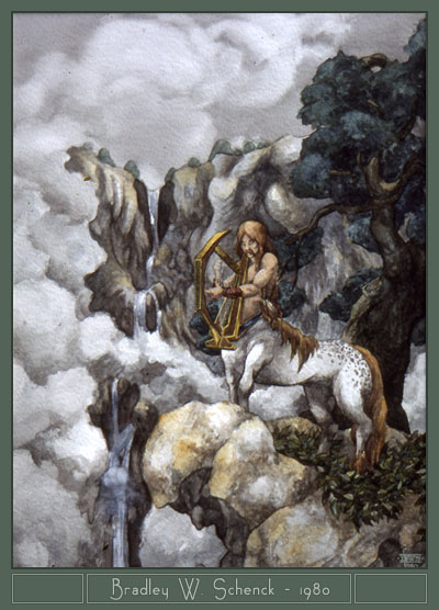
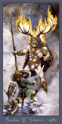 Here are a couple that more or less worked, at least in these low resolutions; some of my old watercolors from 1980 and 1982.
I remember painting the centaur in the summer of 1980, soon after a week spent in Yosemite Valley. (That’s a whole story in itself.) I painted it on some paper I’d bought a few months earlier in Greece. I loved that paper, and I never found anything else that was quite like it. I had to look up the second picture, though – I don’t remember much about it. My notes showed that it, like the centaur, went to my friends and frequent-flying patrons Corey and Lori Cole – but then I crossed that out, so maybe I discovered I was wrong. It’s a mystery.
The only work of mine that’s ever been collectible is from jobs I’d done several years before these, for early role playing games and modules by Wee Warriors and Dave Hargrave’s Arduin. But between you and me… when I did that work I was just a kid, and they’re about what you’d expect from a kid, really. I remember these paintings from the 1980s with a lot more affection, and they’ve aged better.

 A new page has been published in the story The Lair of the Clockwork Book, at Thrilling Tales of the Downright Unusual.