
I’ve got so many irons in the fire – mainly, wrapping up the book designs for the two editions of The Lair of the Clockwork Book and preparing for the next features at Thrilling Tales of the Downright Unusual – that this morning I finally filled up a page in my notebook with lists of tasks. I will say that after a year and a half I do enjoy having a bit less structure to my days: but it turns out that a little bit of structure is sort of necessary.
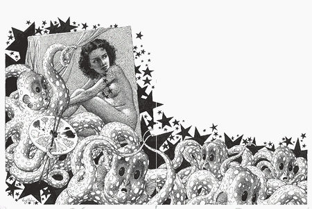
This picture is a very happy surprise. It’s a rough layout for the next real serial for the Thrilling Tales (not counting a sixteen week "Intermission" feature) and the happy part is that it works.
That next Real Serial is going to be a little different in several ways. Its updates will be longer, but will appear only half as often; the illustrations will be in black and white – or, as we see here, at least in monotone; the illustrations themselves will be more tightly coupled to the print version of the story, with two-page spreads and wrapping text; and to support that I’ll have to add additional HTML markup to the story pages. The sample picture I dropped into this layout is one of the illustrations I did last year for Starship Sofa Stories, Vol 3: those illustrations, with their old sf pulp flavor, were the whole seed that grew into this New Plan. It turns out that I’ve always wanted to be Virgil Finlay.

I mean, who wouldn’t?
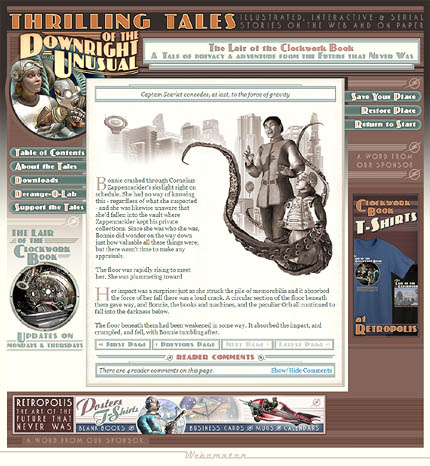
Now the two page spread at the beginning of this post has been compressed down to the usual Thrilling Tales size and the text has wrapped around the image – though not as neatly as we’ll see in the real story. I was convinced that this would not work – that there just wouldn’t be enough space to show both the illustration and its text to their best advantage. I’ve been figuring that I’d need to create a mutant page layout to support the new format. Hence my surprise: it looks like the existing page layout can support these changes just fine. It won’t be as nifty as the print version but it will be a pretty decent conversion.
Now… I’m not sure yet how I’ll handle enlarging the image for the pop-up windows; it’ll be a bit odd if that wrapping text disappears. But the first experiment, anyway, is a success.
In other news I’m now waiting for my second proof of the paperback edition of The Lair of the Clockwork Book. I made substantial changes after I saw the first proof – much more substantial than I had expected to make. The dust has all settled now, though, and I expect that I’ll like what I see when the new version arrives.
Once that fundamental design is set I can start the proofing process for the hardcover edition. I’ve seen paper and linen samples for that now. The interior paper is really, really nice but because it’s a brighter white I may have to make adjustments to the illustrations once I’ve seen the hardcover proof. All in all, though, it seems to be moving along on schedule.
The paperback edition may be available late next week. It all depends on that second proof.
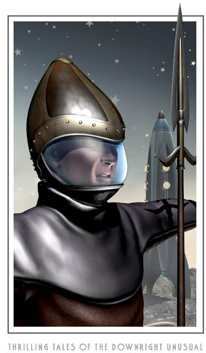
Oh, and then there’s this guy above. The only thing I’m going to say about him is that you should keep an eye on your kittens. ‘Cause you just ought to know.
[tags]thrilling tales of the downright unusual, the lair of the clockwork book, page layouts, experiments, serial fiction, illustrated[/tags]


