
 A new page has been published in the story It Came from the PULP-O-MIZER, at Thrilling Tales of the Downright Unusual.
You can read it here.


 A new page has been published in the story It Came from the PULP-O-MIZER, at Thrilling Tales of the Downright Unusual.

As usual, when things are quiet at the blog it means that I’m up to something. And I am.
I’ve been putting together a new Kickstarter project that’s not quite like my others. The object of the project is to create a limited edition archival print… but it doesn’t stop there. Because in addition to making the picture I’m going to be facing my deepest, creepiest fears by showing people how I did it.
I really hate doing that: but for you, I’ll do anything. Or, anyway, I’ll do this: while I work on the new picture I’m going to keep extensive notes, and I’ll make screen grabs and save some of my hundreds of test renderings and when it’s all done I’m going to assemble all that material into a “Making Of” video that – for backers of the project – will be about as complete a provenance as you can imagine for the limited edition prints. Expect to see and hear more about this next week when I launch the project.
But wait! There’s more!
One of the most important problems in a crowdfunding project is to get people to spread the word. All people, in fact, but especially those with a broad enough platform that they can reach a whole bunch of people themselves: bloggers, podcasters, and so on. So how do you recruit them?
 There are lots of answers to that question. I guess I don’t know any of them. But the answer I’m proposing is that you offer them something that – I hope – they want. To do that I will fire up the PULP-O-MIZER‘s special, untested Here’s What You Want attachment, and I’ll offer to make customized title graphics for those brave backers who sign on for these Bonus Rewards.
The Pulp-O-Mizer rewards will kick in when the project’s funding reaches certain milestones. There will be a limited number of Pulp-O-Mizer rewards available at each level. And at each level the Pulp-O-Mizer rewards will cost a little bit more than they did at the last level. A blogger, podcaster, band or other entity that really wants a custom Pulp-O-Mizer title graphic would be well advised to get on the boat early; and if all those bonus rewards are taken, that would-be backer ought to be motivated to use every means at his or her disposal to promote the project, so that the next level will get unlocked.
See what I did there? Offer something that people with a lot of reach may want, and make them use that reach to get it. It’s a million to one chance… but it might… just… work.
Edit: it’s ALIIIIIIVE!


 A new page has been published in the story It Came from the PULP-O-MIZER, at Thrilling Tales of the Downright Unusual.
 A new page has been published in the story It Came from the PULP-O-MIZER, at Thrilling Tales of the Downright Unusual.
 A new page has been published in the story It Came from the PULP-O-MIZER, at Thrilling Tales of the Downright Unusual.
 A new page has been published in the story It Came from the PULP-O-MIZER, at Thrilling Tales of the Downright Unusual.
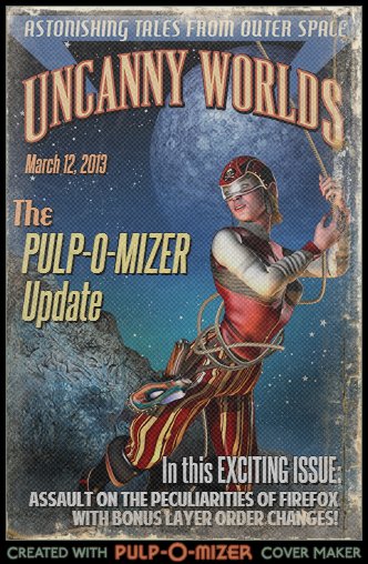
Because web browsers can be just as divisive as religions I try not to judge, mainly because people throw rocks at me when I do. But I probably haven’t concealed the fact that – as far as the Pulp-O-Mizer is concerned – Firefox stands out as the Village Idiot of browsers. That’s a problem, because Firefox has been gaining in popularity lately and so a large proportion of Pulp-O-Mizer operators have been getting a rockier experience than I’d like.
Within a week of the Pulp-O-Mizer’s escape from the Secret Laboratory I managed to fix almost every Firefox problem, including some unique problems with older versions of the browser. There was just one big, annoying problem left: Firefox would often draw the Pulp-O-Mizer layers twice when it was rendering a web resolution graphic.
Chances are you’d only realize that had happened when it was the distressed overlay layer that was drawn twice; some of those Firefox images turned out to be extremely distressed, as did I, when I saw them. From time to time a Firefox text layer would be also drawn behind the foreground layer – a bug so improbable that I sort of admired what Firefox had managed to do, there. This was almost certainly another instance of the same problem.
Well, about a week ago I thought of a way to work around that and this morning – when I was finally able to try it – it looks as though I did. Firefox will now draw a web resolution image slightly more slowly, but (I think!) without any risk of drawing the layers twice.
I made one other change. When I was building the T-Shirt images it turned out to be very important that I draw the text layer behind the title layer. In rare cases – when your text was overlapping the title graphic – the T-Shirt image would be slightly different than any other version. So I’ve changed that, too.
Now both the Pulp-O-Mizer preview and the web resolution images place the text layer behind the title layer; and soon I’ll change the product templates so that mugs, iPad covers, and other products will do the same thing.
Very few of you will notice that change. But the Pulp-O-Mizer knows.
But of course that’s not the only Pulp-O-Mizer update: all along I’ve been using those spare hours (!) that I find under my pillow to add more image layers for your Pulp-O-Mizing pleasure. The latest of those are the one-two tag team of Dinosaurs and Leprechauns. Dinosaurs, because… well… Dinosaurs! And Leprechauns, because we just need more choices in that Holidays section.
I’m not a big fan of early 20th century Irish American merchandising and so I don’t have a lot to do with shamrocks, leprechauns, and other Madison Avenue excesses. If I can help it. Therefore I made my leprechaun look a bit like Hunter S. Thompson. I’m a complicated person.

 A new page has been published in the story It Came from the PULP-O-MIZER, at Thrilling Tales of the Downright Unusual.
 A new page has been published in the story It Came from the PULP-O-MIZER, at Thrilling Tales of the Downright Unusual.
 A new page has been published in the story It Came from the PULP-O-MIZER, at Thrilling Tales of the Downright Unusual.