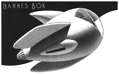

In the middle of his reminiscences of the pulp magazines of the ’30s and ’40s, Frederik Pohl has started to tell us about his memories of the illustrator Hannes Bok – and I have to admit that although I like his work, till now I knew practically nothing about him.
Bok was a contemporary of the inhumanly skilful Virgil Finlay; but while their rendering styles had something in common there was no commonality at all in their very different visual imaginations. Bok is strange and stylized and curious; Finlay is elegant and, I suppose, more accessible.
This comes at an appropriate time for me: I’ve just finished a greyscale illustration for a tale in Starship Sofa Stories #3. Working to greyscale was challenging, much as shooting a film in black and white is challenging – I had to make even more persnickety adjustments to my lights and materials than I usually do. But I found that I loved the result.
I keep looking at that picture and wondering whether I’ve found the solution (or part of one) for a project that’s been going in and out of the Idea Closet for years now. Grey is…. tasty. I’d forgotten.
Anyhow, here’s to the mysterious Hannes Bok. I think now that every time I recall my days of hitch-hiking to the art shows at science fiction conventions, I’ll think about him, too – some things never change!
Now continued in Part Two.
[tags]hannes bok, frederik pohl, pulp art, illustration, golden age[/tags]


Whenever I see Bok’s stunning, textural images in B & W, I can’t help but think they left a legacy to artists like Chris van Allsburg (Jimanji, Polar Express, etc.) whose work is also vividly monochrome: