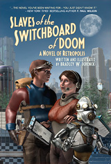
We’re just two weeks away from the release date for Slaves of the Switchboard of Doom. If you’ve been waiting, that may seem like a long time: but as you’ll see in this post I’ve been waiting for about five years.
So bear with me. It’s almost here.
Illustrating your own story is, mostly, a pretty great thing; it’s just that it’s more embarrassing when you make mistakes.
On the ‘mostly great’ side, I was able to work on my characters’ appearance while I was still figuring out who they were. The version of Dash Kent we see in the book was my second try. (Version One looked too old for Dash, and he didn’t have quite the right attitude.) Working on the character models was a big help to me during the early days of writing the book. I got to find out exactly how these people looked.
There are several characters who existed already, since they’d appeared earlier in The Lair of the Clockwork Book. Harry Roy, Maria da Cunha, and Mr. King all came from that story. Rusty was even older: I was working on him back in 1999.
But Dash, Nola Gardner, Thorgeir, Howard Pitt, Lillian Krajnik, and most of the other robots were all new. I built many of them while the story was taking shape.
Once the first, and then the second, and then the third draft were behind me I was ready to start the illustrations themselves. I’m not quite sure when that was, honestly. Even the datestamps on the files don’t help me much; I can see that I created a bunch of folders on March 2, 2014, but that only tells me that I organized things on that date. I’m pretty sure the real beginning was some time in the previous December. The first one may have been this scene in Lillian’s laboratory, from Chapter 15.
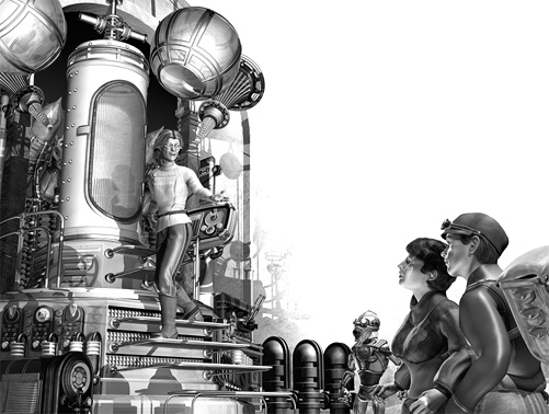
I was creating just one illustration for each chapter this time – far fewer than I’d done in my earlier stories – and that meant picking That One Scene was always the first problem. Because there were relatively few pictures, one part of the problem was which characters were getting their chance to be featured. I was already planning the endpapers, where all the major characters would get a vignette; but I wanted them each to show up in the body of the book as well. So picking That One Scene could be complicated.
With that done, I came to the magical thing about illustrating your own work. Sometimes the scene in the picture was better than the scene in the text. And since the text was mine, I could change it. This happened several times. It’s a liberty you just can’t take with somebody else’s story.
On the other hand, there were times when the scene in the picture differed from the scene in the text… and I didn’t realize it. Finding those, and resolving the problems, was an ongoing task while I worked on the revisions to the book. And I know of one that was never fixed, a pretty big contradiction that I didn’t see until I was checking the galleys. It’s still there and, no, I won’t tell you where it is. Somebody’s sure to point it out to me, and then I’ll explain the Navajo philosophy about imperfections: they’re there so that wandering spirits have a way to get out of the work, if they should blunder into it and get lost.
This is a philosophy that can be pretty convenient.
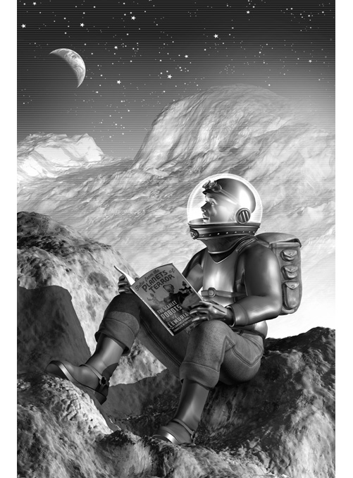
There were times when avoiding a contradiction was pretty frustrating, though, since in an illustration you want to convey a sense of what’s going on but you can’t make visible things that shouldn’t be visible. That problem led me down a rabbit hole several times when it came to the first chapter. I think I did more versions of that one than any other, even though what you see in Chapter One is pretty simple. But… oh, the many layouts. The many changes. The many deletions.
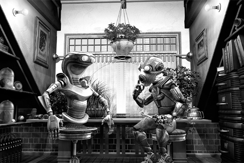
Rusty’s attic apartment, in Chapter Two, was pretty much the opposite. It was full of stuff, and I loved that stuff; but the picture wasn’t about that stuff. His books, his gadgets, and his collection of interesting mosses are all there, but they have to fade away behind the robots. There was even more stuff, out of frame. It saddened me that I had to leave it there.
Around the end of September, 2014 I finished my first pass through the illustrations for Slaves of the Switchboard of Doom. But I went back to revise them, and I did that more than once: there are three or four different versions of some of them. I didn’t lock them down until about a year ago. But at some point you have to realize that you’re done, and so around June of 2016 I admitted that I was done with these.
For The Lair of the Clockwork Book I created close to 130 illustrations, and that took far longer than it took to write the story; for Slaves of the Switchboard of Doom I made just twenty-four (counting the title page and the endpapers), and the story and its art took roughly equal amounts of time. That’s a much more workable ratio, if you ask me: and I was also able to spend a lot more time on each picture.
Among the differences I love in the new book is the way the text wraps around the illustrations, so like the illustrations in the old science fiction pulps. And the shift from color to greyscale, which was a purely practical decision, has pretty much the same effect. The art for the book evokes Dash’s approach to adventuring. He learned everything he knows from pulp magazines.
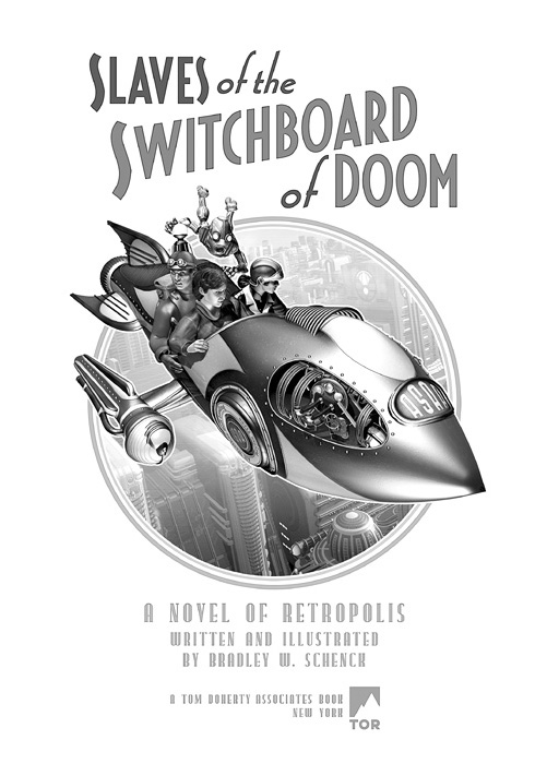
That’s not true of the publisher, though: you won’t find any of that yellowing, pulpy paper here. The paper chosen for the book is so wonderfully dense and white that the book weighs more than you’d expect. That’s especially surprising because the paper’s not unusually thick. But the book’s weight was the first thing I heard about it, and once I’d hefted one myself I tried to exhaust every possible joke about that on Facebook and Twitter.
But you can understand why, when you see how little ghosting there is from one page to its reverse – even when the art is dark. This is a book with what I call confident weight.
You’ll have your own chance to gauge its weight in just two weeks, on June 13. I hope you take that chance!


