
One of my very first posts here at the Web-O-Blog was about Alexis Van der Hague’s animation Stilt Walkers: an animated short that was rendered with 3D tools in such a way that it recalled the style of traditional paintings. That, and the lyrical style of the piece, impressed the heck out of me. Just lovely.
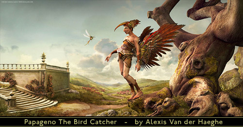
3D Total is hosting a "Making Of" article for a new image by Van der Hague. Here we see a portrait, within an 18th century landscape, of Papageno from Mozart’s The Magic Flute.
This time around we get not just the final product, which is sensational, but a breakdown of how Van der Hague has used 3D tools (ZBrush, Maya, and Mudbox) to build something that’s beautifully not photorealistic. That’s pretty close to a description of what I try to do. It’s just that the "not photorealistic" styles we’re each aiming for are pretty different.
This article’s a great example of how that can be done. Excellent work!


Thanks so much for posting!
When I was in middle school and high school, I was enamored with the idea of painting / illustrating (using traditional tools) in the style of Michael Whelan, Frazetta, and all the comic book cover painters I loved during the ’80s (Bill Sienkiewicz, John Bolton, etc).
Unfortunately, I was steered towards a more conventional (less “risky”) career path, which I regret now. But have been very inspired by the traditional media look that’s now being achieved with digital tools, and look forward to jumping into it…when time and finances allow!
D
Well, heck, there’s always… paint! I do regret that my hands have forgotten what they used to know about painting, myself.
And as far as the teen years go: I can remember thinking about Frazetta, “If I could paint like that, I wouldn’t stop to eat!” Although I never did paint “like that” there was a bit of irony in there that I didn’t grasp till later :).
Mr. Schenck,
Your work continues to amaze me. I truly love the themes as they remind me of the best of Buck Rogers and Flash Gordon. I really enjoyed viewing the coffee shop paintings. I wish to purchase archival prints of the series of two (or by now maybe three). Could you advise what finish seems to come off the best with these?
Thank you,
Jim
Hi, Jim –
Thanks!
Which finish you like on the prints really depends on, well, on what you like. I used to think that the glossy prints punched the detail a bit more but matte’s grown on me. If you just can’t make up your mind, you could compromise on the “Lustre” finish, since it’s a sort of semi gloss finish that splits the difference.
Your opinion is what I was looking for. The art is wonderful and want the detail to show through as they will go in my office at work. “Just around the corner” and “Another Cup of Coffee” seem a set, is there a third in the series? The Bee’s Knees Cafe seems to compliment nicely. Also are the archival prints numbered or signed? The humor and life you put into your work is like Norman Rockwell meets the Jetsons. Thanks.
Jim
Crap… I meant the works are complementary. I hate it when my idiot is showing. Have a great evening.
It’s odd, I really meant to do a third picture in the diner, but it just never gelled.
Numbering the prints would be sort of silly – you do that when you have a limited edition, and that’s because in older printing processes the plate(s) would wear out. Making *these* limited editions would just be an artificial way to make you think they had some greater intrinsic value.
And nope, they’re not signed, either; they don’t normally even pass through my hands because they ship directly from the printer.