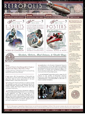
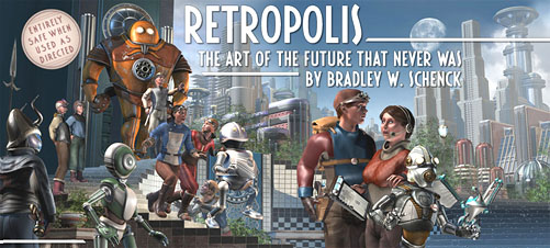
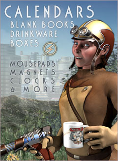
I’ve spent the last two weeks on two projects: rebuilding part of my front porch (which you probably don’t care about unless you’re knocking on my door), and creating a phone-friendly redesign of my Retropolis web site.
I’m not crazy about the ways that phones have affected web page design – and I really miss my old page layouts – but because I am also not actually crazy I finally caved in to peer pressure and converted the site into something that works well on phones. Mostly.
The big exception is the Business Card Construction Kit. You still need a much wider browser window to do much with that one.
But in every other respect you can now shop quite comfortably even on one of those tiny, ridiculous devices that you all use.
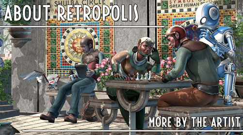
So go do that, please, while I dart outdoors between the rainstorms and try to get my deck boards nailed down in time for Winter.
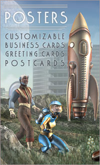
As always, you can find the Retropolis Transit Authority T-shirts, along with posters, greeting cards, postcards, business cards, and other things that are not cards. Like, uh, coffee mugs. And books. And other stuff. Go get ’em!
This entry was posted on Monday, October 22nd, 2018
and was filed under Print On Demand, Thrilling Tales of the Downright Unusual, Web Development, Works in Progress
There have been no responses »
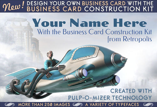
I’ve been selling customizable business cards for several years now at Retropolis and The Celtic Art Works. Customers would click on a sample image and be carried over to the Zazzle site, where they could edit the text on that card design to their own specification. The system worked pretty well, and a lot of people bought their business cards that way; but I’ve always thought it could work better.
After I built the Pulp-O-Mizer I could even see how it might be better: if all the possible background images were available in menus, and the whole user interface worked a bit more like the Pulp-O-Mizer, I figured that the process would not only be more fun, but more engaging. Customers would be able to try out all sorts of possibilities… so they would. They’d be more likely to buy their cards once they’d invested their time in them. It could work out better for all of us.
But it wouldn’t be a small job, and I’d need a fair-sized block of time to work on it.
As it turns out, the job took about a month.
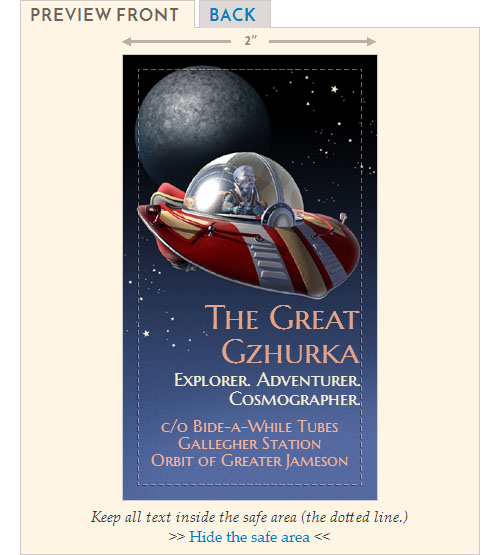
It’s alive! Alive, I tell you!
So today I’ve unveiled the Business Card Construction Kit at Retropolis. (It’ll show up soon at The Celtic Art Works, too; but I’ve included all the Celtic art backgrounds already.)
The Business Card Construction Kit includes much of what the Pulp-O-Mizer does, but it also does more. You can design a business card in either horizontal/landscape or vertical/portrait shapes; you can have images and text on both the front and the back of the business cards; you can select any colors you like for your text; you have over 250 background images from which to choose, along with a wide variety of typefaces; and I’ve made innumerable little improvements to the user interface and user feedback.
It’s a pretty nice system!
Over 250 background images
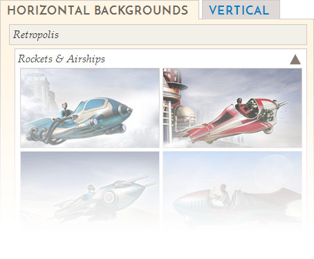
The background images are divided by subject and style; in addition there are separate menus of images for the front and back of the cards. (That’s because the card stocks are usually coated on just one side, so an image that works well on the front may not look as good on the back of the card.)
There are a lot of Retropolis images, of course, but I’ve included all the old Celtic card backgrounds from The Celtic Art Works, and then added a lot of new border designs and images in that style. And I can continue to add more designs and styles as time goes on.
Many text controls, typefaces, and selectable text colors
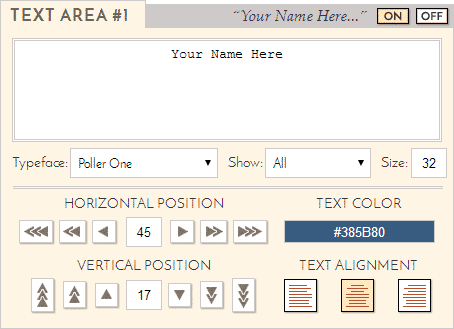
Both the front and back of your business card can have up to six different areas of text, each with their own controls.
The color selector is something that I decided to leave out of the Pulp-O-Mizer, but it makes a lot of sense here.
And because there are so many typefaces available in the Business Card Construction Kit I’ve given you a second menu, which you can use to filter the typeface list by font type: Serif, Sans Serif, Hand Lettered, or All.
Save, export, and share your card designs
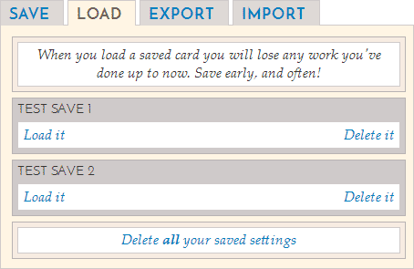
In order to save, move, or share your card designs, you get the same options as you do in the Pulp-O-Mizer. You can save and load locally, or you can export your card data as a block of text that can be imported into the Construction Kit on another device or browser.
There’s also a menu of example designs that you can load, and learn from, and even use as the basis for your own business card.
So that’s what I’ve been working on. I think it’s a much improved system for buying your customized business cards, and it’s designed to grow, as well. Give it a spin!
This entry was posted on Tuesday, November 28th, 2017
and was filed under Print On Demand, Web Development, Works in Progress
There have been 2 Responses »
This entry was posted on Wednesday, July 3rd, 2013
and was filed under Print On Demand, Works in Progress
There have been 2 Responses »


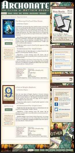
A few days ago I put up a working online bookshop for Matthew Hughes’ Archonate web site – actually it’s the second book shop there, since I’ve been feeding his site with eBooks all year long.
This one’s different because it’s stocked with print-on-demand paperback books, printed and shipped by CreateSpace. CreateSpace allows self-publishers to sell through several sales channels; the author gets a different cut of the sales price at each one. You can buy these paperback books at Amazon – in several countries – or direct from CreateSpace. It’s not surprising that an author gets a much better percentage of the sale if it’s made through the CreateSpace “store”.
But the CreateSpace stores are primitive objects. Each one offers just a single book and there’s no way for an author to tie all those individual book pages into one single, unified storefront, which is sort of necessary if you hope to sell your books online without a middleman like Amazon.
The Archonate‘s CreateSpace store is a proof of concept for what I’m working on now – a WordPress plugin that lets you combine any number of books into any number of category pages and host them – all together, all with a single shopping cart – within your WordPress blog. All an author needs to do is to set up the shop and go back to writing promote it.
You can see a screenshot of the admin screen for the plugin below.
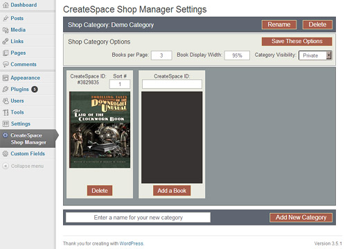
It’s going to take me awhile; this is my first WordPress plugin, and the past few days have been made livelier by my creative use of language while I discovered new and exciting things to yell about.
At the moment I’ve managed to create a plugin that WordPress recognizes, set up its configuration screen, and add and retrieve the plugin’s options from the WordPress database. That’s been a heck of a lot of work for a plugin that doesn’t do anything yet, but I have the working proof of concept to look at while I’m, um, swearing.
I like the way the content is pulled in from CreateSpace and modified in ways that the user can extend. So long as the WordPress blog is cached, this adds very little work for the blog’s server or for the CreateSpace server. All in all, I think it’s pretty neat.
Once it’s done I might even do a very similar thing for Amazon affiliate sales, which, of course, aren’t limited to books. I’ve used Amazon’s own AStore system (you can see an implementation right here in my blog) but having used it, I know how cumbersome and unwieldy a thing it is. Surprisingly, it looks like I can do better. So maybe I will.
This entry was posted on Saturday, May 25th, 2013
and was filed under Print On Demand, Works in Progress
There have been 4 Responses »


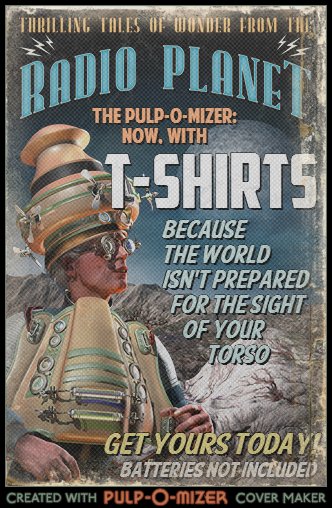
I’ve just updated the Astonishing PULP-O-MIZER: I’ve given it unnatural powers of T-Shirt and Hoodie Creation that I’m pretty sure Man Was Not Meant to Wot Of. I barely wotted of them myself, if the truth be told. It was a near thing.
I’ll need to keep an eye on the server’s status. Creating the shirts – and then displaying, deleting, hiding and showing them – eats up more resources than we’ve seen with the other products. There’s the chance that shirts will go in and out of service, all depending on the server’s load and my own demented whims.
If I say so myself – which I do, you notice – it’s a pretty neat system, though. Each user gets his or her own private folder of shirts (so they can’t prowl through the shirts that other people have made); one can delete all the shirts in one grand gesture of destruction (that part was easy) or one can select a single shirt or hoodie and doom it to be fed, alone and shrieking, into the mouth of the Destructinator* (that part was hard).
It’s all brand new, so here’s your chance to break it. I’ve tested it in every browser and OS I have and I’m pretty sure it won’t explode. But you should wear those rubber gloves and goggles, just in case.
*… a name that I wish I’d invented, even though I didn’t.
This entry was posted on Sunday, March 3rd, 2013
and was filed under Print On Demand, Web Development
There have been no responses »
A couple of weeks ago I posted the first in a series of articles about my experiences in putting together a single web site that combines products from several different print-on-demand companies. For a better idea of what I was trying to do, and what I felt the design priorities were, you should have a look at that article.
You’re back? Okay then.
In order to get the basic function of the site working, I used three different solutions from three different sources. I’ll be writing about each of them in detail as we go. For today, let’s start with an overview of those three solutions.
They are CPShop, for Cafepress content; the Zazzle Store Builder (ZSB) for Zazzle content; and myPFStore, for Printfection content. Here’s a basic description of their features.
(more…)
This entry was posted on Friday, December 11th, 2009
and was filed under Print On Demand, Web Development
There have been 2 Responses »
The first in a series of articles that describe how I combined products from several different print on demand companies into a single web site at my own domain.
 The design of a web site is always about several things, and only one of those things is "making it pretty". In fact the way you make it pretty all depends on the decisions you’ve made about what the purpose of the site will be (often not as obvious as you might think), what the content will be, how the user will find that content, and how the user will understand where he or she is within the site – and then be able to get elsewhere with as few clicks as you can manage.
The answers to those questions determine the framework within which you will make the site pretty. That’s because these answers tell you what you’re designing. If you leap off to figure out what it’s going to look like without answering those questions first you’re going to end up with something that (presumably) looks great, but whether it does the job it needs to do is left completely to chance.
(more…)
This entry was posted on Tuesday, November 24th, 2009
and was filed under Print On Demand, Web Development
There have been 6 Responses »
 So… when last we saw our hero, who at that time was me, I was working on the second half of my illustrations for Thrilling Tales of the Downright Unusual.
Then, to all appearances, I vanished.
Here’s why:
In the annual ramp up to the holiday season – that happy, carefree and yet spiritual time when I turn you upside down and try to shake all the change out of your pockets – I took on a big project that’s been on my mind for the last couple of years.
There are a whole bunch of places on the web where I sell my work, as posters and prints, on the ever-popular t-shirts of the Retropolis Transit Authority and – new, this year – on customizable business cards and other nifty swag at the Retropolis Travel Bureau. The trouble is that although I do cross-link between them, where I’m able, there was no central clearing house for all these different things. A visitor to one would usually not realize that the others existed.
So I’ve just completed that very clearing house: an "Art of Retropolis" site where I combine the products I sell through different vendors so that they’re all available in one spot.
In order to do that I had to combine three different scripts to draw in the products, along with quite a few static pages, in such a way that (I hope) it’s not confusing to the user, and moreover – when the all powerful Googlebot sees it – the site does not look as though someone’s simply scraped existing content from my original online shops. Which is pretty much a death sentence where SEO’s concerned. These two issues were such important and interesting problems that I may write up the project later on.
But for now, IT’S ALIVE!!!!!
If it works as well as I hope it will, I’ll probably do the same thing with my scattered Celtic art shops. Sometime next year.
And Thrilling Tales? I was already aware that creating the illustrations for its first story was taking longer than I’d expected. So its launch – which I’d hoped would happen right about now, or soon after – will be taking place early next year.
This entry was posted on Friday, November 20th, 2009
and was filed under Print On Demand, Web Development, Works in Progress
There have been 2 Responses »

Two weeks ago I started to set up my first gallery/store at Zazzle; when the powers that be there saw what I was putting on the gallery’s front page they ushered me into the closed beta of their new Store Customization system. I set up a second gallery there this week, and the other night they opened up the beta so everyone could play.
This turned out to be perfect timing for me. I’d had a chance to experiment with a system that was almost ready for release (this means there was documentation!) and which as a result was pretty solid. I’d gone through about a week and a half of trying to figure out how to do the things that just about anyone would want to do and it was all fresh in my mind.
So I wrote up three tutorials at the Zazzle forum, which I’ve retooled a bit and reformatted to post here.
1. Skinning the Zazzle Sidebar
This is a step-by-step tutorial with sample graphics. It shows you how to use three small images, some CSS, and some HTML to change the appearance of your Zazzle sidebar.
2. How to Reorganize Your Zazzle Sidebar
This shows you how Zazzle’s modular elements fit together to build a store’s sidebar, and how you can move those elements around till you like ’em.
3. How to Add a New, Custom Page to Your Zazzle Store
Here’s another step-by-step tutorial that helps you to create an entirely new page, which comes up in the sidebar like any of the standard pages and can contain your own custom content. It’s much easier to do than to explain!
This entry was posted on Sunday, May 10th, 2009
and was filed under Print On Demand, Web Development
There has been 1 Response »
Every now and then, Cafepress makes a fundamental change in its terms of service for shopkeepers, and almost without exception there’s a huge backlash by shopkeepers who believe that this new change is going to have a severe impact on their income. Often, they’re right. Even when they’re wrong it’s annoying that a party with which you do business can redefine the terms of your agreement with them at any time, while you can’t – ever – do the same thing. Or anything like it.
In fact (especially over the past two years) Cafepress has been nickel and diming away at its shopkeeper/designers in what’s probably been meant as an effort to maximize profits. Often, by the looks of it, this to make the company’s balance sheets continue to escalate quarter by quarter in a way that will be sweet music to to the ears of investors in the event of a probable IPO. Anyone who’s chased that particular dragon knows that once you start it becomes more and more difficult to pull off the same scale of growth in each quarter. It only gets harder if you do go public.
From the shopkeepers’ perspective, though, it looks as though the company is finding every way it can to monetize not the customers who buy all this merchandise, but the shopkeepers who create it. That impression was reinforced a few months ago when very large Cafepress stores (those with more than 500 sections) were abolished, though existing shops were grandfathered in. Shopkeepers who wanted to bloat their ventures with more merchandise than that were going to have to establish additional premium shops, for additional monthly fees.
This month’s brouhaha is all about the Cafepress volume bonus, a plan through which those shops with a high sales volume are rewarded by incremental bonuses: the more you sell, the larger your bonus. The volume sales bonus has often been named by CP shopkeepers as the reason they would stay with Cafepress rather than moving to a competitor.
Back in 2002, when I started my first Cafepress shop, it was understood that this bonus was a reward for the promotion a shopkeeper did to increase sales at his or her shop. And as little as I think of the company’s maneuvers over the past couple of years I think that the new program is better suited to that end. Not that I don’t think it’s seriously flawed – but the flaws I see are of another kind entirely.
(more…)
This entry was posted on Thursday, July 24th, 2008
and was filed under Can't Stop Thinking, Print On Demand
There have been 8 Responses »





 The design of a web site is always about several things, and only one of those things is "making it pretty". In fact the way you make it pretty all depends on the decisions you’ve made about what the purpose of the site will be (often not as obvious as you might think), what the content will be, how the user will find that content, and how the user will understand where he or she is within the site – and then be able to get elsewhere with as few clicks as you can manage.
