Webomator: Bradley W. Schenck's blog
Bradley W. Schenck's books Webomator Blog Topics Archives Retro Sci Fi
Search retro robot art
Subscribe RSS retro future Bradley W. Schenck at Facebook Bradley W. Schenck at Goodreads Bradley W. Schenck on Twitter Bradley W. Schenck at DeviantArt Bradley W. Schenck Also by Bradley W. Schenck I play games.
Topic Archive: Works in Progress
A Pulp-O-Mizer Halloween; also, more Virgil Finlay covers, and an update on Vika’s Avenger

Filed under Found on the Web, Works in Progress

The PULP-O-MIZER does Halloween

I’ve fed the gaping, cavernous maw of the PULP-O-MIZER with a couple of new Halloween images; you can find them in the "Holidays & Occasions" panel. I’ve been a little remiss about adding holidays over the summer and this is just my horrific and soul-wrenching way of making amends.

In other news, there are even more Virgil Finlay magazine covers over at The Geeky Nerherder. Because you just can’t ever have too much Virgil Finlay.

Virgil Finaly covers at the Geeky Nerfherder

In even more other and completely different news, I may have finished the book design for Lawrence Watt-Evans’ Vika’s Avenger. The last task was the dust jacket for the hardcover edition, and we can’t be sure I’ve nailed it until the author gets back from his travels next week. The eBook editions, Kickstarter bonus PDFs, and interior book layout are all ready to roll after a final round of proofing.

The two hardcover editions are being printed by different companies and that does introduce the potential for eldritch, batrachian evils that have not been seen on this world since its earliest, antedeluvian age… when the Old Ones roared from the steaming craters of ancient volcanos, and the Elder Gods ruled unchallenged from their carven basalt thrones, and people who must not be named got a little too carried away by that whole Halloween thing.


IEEE’s cover story about me from 1994 – found online as a PDF

Filed under Found on the Web, Works in Progress

"The Forge", a 16 color image from 1988

I’ve just run across this PDF version of an article about me from the July 1994 issue of the IEEE’s magazine IEEE Computer Graphics and Applications. There are a few little inaccuracies in there (there always are) but on the whole Karen Whitehouse did a pretty creditable job of trying to make sense of me and my work.

My apologies for the quality of these images: they’re taken from the PDF, which was scanned from the magazine.

The picture above (adjusted here to correct its aspect ratio) was an example of a dithering technique I used in the late 1980’s, using just 16 colors to create the illusion of a much broader palette. I never used it for anything that was published – except in this article, I guess – and the technique had already become obsolete by the time the article appeared. Still, that’s one of the things I’m proudest of from my early days in computer graphics. Dan Silva, the programmer of EA’s Deluxe Paint, sort of shook his head in disbelief when I showed him how it worked.

Study (1993) by Bradley W. Schenck

At left you can see a concept image for a game project that might have followed The Labyrinth of Time, had we come to terms with EA or another publisher. I recall what we meant to do, and how we meant to do it, so I have a feeling that we’d have bogged down on the new character methods we had in mind. Character heads would have been scanned from clay models, and what I didn’t fully dread at that time was how messy and unusable those 3D scans would have been.

Still… it sure would have been neat.

For myself what astonishes me about the interview is that even though (I think) we conducted it over the telephone I seem to have managed complete sentences and a couple of quips.


Cover for Lawrence Watt-Evans’ Vika’s Avenger

Filed under Works in Progress

Cover for Vika's Avenger

Lawrence Watt-Evans has posted this to his Facebook page, and I guess that means I can post it too, now. Here’s the cover illustration for his Kickstarter-funded Vika’s Avenger.

I’m working on the interior illustrations now. They’ll be a lot like the illustrations I did for Starship Sofa Stories; they’re rendered in the same way I do my full color work but – of course – in greyscale, and I’m aiming for a kind of open layout, with the images enclosing the text, that I hope is something like those wonderful old illustrations by Virgil Finlay and others back in the age of magazines.

Like these two, I mean:

Illustrations for Starship Sofa Stories

This ought to keep me stapled to my desk for the next few weeks. I don’t mind: I really like working on books. The style of the book layout here will be a lot like what I planned for my next Thrilling Tales book, which is still in a state of primal chaos.


Vika’s Avenger at Kickstarter: one more stretch goal to go

Filed under Works in Progress

Lawrence Watt-Evans and Vika's Avenger, at KickstarterLawrence Watt-Evans’ Vika’s Avenger is now less than 60 hours from its Kickstarter deadline, and it’s less than $1000 away from its next stretch goal: an appendix called A Traveler’s Guide to Ragbaan that will give readers a broader, different sort of look at the ancient offworld city where most of the story’s events take place.


Now, it could be said that I don’t have a horse in the race any more; with the last stretch goal the budget for interior illustrations brought their total up to six, and they’re going to stay there: the author and I have worked out a plan for which scenes to illustrate, and it ought to make a nice spread throughout the book.

But I have the advantage of having read the unedited manuscript and I know that you and I would both like a chance to see a little deeper into the layers of history – most of it misunderstood, or forgotten – that lie beneath the airship docks, the ruins, and the palaces and taverns of Ragbaan.

And who knows? It’s not impossible that we might learn a little more about this creature, who is not Vika and is not her avenger, which is about all I can say on the matter.

The cover should be finished this week; after that I’ll be diving into those six black and white illustrations. So I know what I’ll be doing: I just don’t know if you’ll be in there with me.


At Kickstarter: more pledges for Vika’s Avenger mean more illustrations by me

Filed under Works in Progress

Lawrence Watt-Evans' Vika's Avenger, at KickstarterWith eight days left to go, Lawrence Watt-Evans’ Vika’s Avenger is just $100 away from its next stretch goal at Kickstarter: that means that we’re nearly certain to see several more of my interior illustrations in the book.

I’m really liking the concepts and cover roughs I’m working on, but I can’t show them to you; in fact, even the author hasn’t seen the latest yet. So sharing them with you would be rude, at the least. But there are some neat things happening for the far-future adventure story. It’s set in a world with such a long history that civilization has come and gone several times, and the inhabitants of the ruined city of Ragbaan are surrounded by artifacts from that long history; the artifacts are so mysterious and ancient that they seem like magic.

Once Watt-Evans has cajoled you into that next $100 in pledges I’ll have more work to do on the illustrations – I’m not quite sure what the new total number will be – and then beyond that, if the project hits $12,000 he’ll add something new to the book. That’ll be A Traveler’s Guide to Ragbaan, which would be a very handy tourist guide for the city’s perplexed – and endangered – visitors. Stay tuned!


Back Lawrence Watt-Evans’ new novel at Kickstarter, and it will get more and more art by me

Filed under Works in Progress

Lawrence Watt-Evans' Vika's Avenger, at KickstarterIf you want to know what character this is a concept for, you’ll just have to hie yourself over to Lawrence Watt-Evans’ Kickstarter page for his science fantasy novel Vika’s Avenger and then plonk your money down on the table.

If you’re not as ancient as Watt-Evans and I am you may not know that "science fantasy" once described the sort of ray guns and airships adventure stories written by Edgar Rice Burroughs, Otis Adelbert Kline, Henry Kuttner, Leigh Brackett and many other authors; it’s the sub-genre of science fiction that later on led to things with bigger budgets, like that Lucas guy’s movies. It’s science fiction without the problematic physics; and although I like my problematic physics as well as the next guy, I also kind of like big four-armed Tharks scything down their enemies from the backs of their thundering thoats.

The Kickstarter campaign has met its original goal and now, if I’m counting correctly, two of its stretch goals. At least one of those stretch goals turned out to be me.

Yep, I’m happy to say I’ll be doing the cover for the book and – so far – three interior illustrations. Along the way I’m also doing the book design, but that bores you and so I’ll quickly explain that although I am now on board for the book I will be doing more and more illustrations… depending on how much money the project can raise.

So at the moment, we’re looking at the cover (in color) and three interior illustrations. But the project is just $1500 away from its next stretch goal and if it reaches that, well, I’ll be doing even more interior art for the book. That will continue up to some sane limit, so I won’t ever be doing more illustrations than there is text to go with them. Which would be strange.

But for the time being – and until we reach that limit of sanity – more pledges mean more illustrations (by me) and therefore more work (for me) and those are just two of the many reasons why you ought to go drop a dime on Vika’s Avenger at Kickstarter.


Big Changes at both Retropolis and the Celtic Art Works, including some lower prices

Filed under Print On Demand, Works in Progress

New merchandise from the Retropolis Rocket WorksLast week I started some major rework at both Retropolis and The Celtic Art Works. Up to today the changes have been fairly subtle, dealing mainly with what merchandise is available from which vendors. But today I’ve started a facelift at Retropolis, starting out with the home page.

The facelift is going to continue, with new home page content and a new header across the entire site. In fact I may even rework the underlying HTML so that it’ll be more compatible with some things I may want to add in the future – things that build on the methods I used when I built the Pulp-O-Mizer.

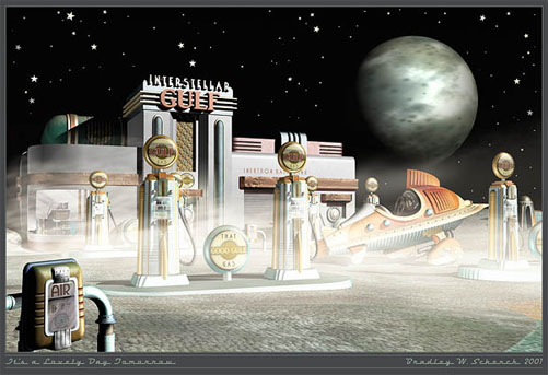
But what you’re likely to notice first is the new splash image at the Retropolis home page. If you delve a little deeper you may realize that a lot of merchandise that used to come from the Retropolis Travel Bureau (at Zazzle) is now being sold through the Retropolis Rocket Works (at CafePress). Something similar is going on at my Celtic Art Works site.

That’s because recent changes to Zazzle’s policies mean that two things have happened: you’re being charged more for their merchandise, while simultaneously, I make less. It’s a lose-lose situation. Unless your name is "Zazzle", I mean. So I’m taking these steps to get us both a better deal.

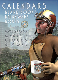
The new Retropolis Rocket Works merchandise includes coffee mugs, magnets, buttons, mouse pads, and other things that formerly came from Zazzle… at far more attractive prices. I’ve even started by giving those items a pretty low markup, which may or may not continue, depending on what effect that has on sales. (An unfortunate truth about print on demand merchandise is that even with a minimal markup the goods will always be more expensive than mass produced merchandise. So in practice, since one can’t compete on price, it usually works out better to increase the markup.We’ll see how this experiment with lower prices works out. It may be for a limited time only, like they say.)

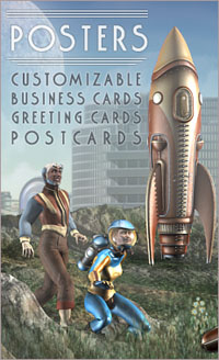
The holdout is posters. The Zazzle price increase, combined with how difficult they make it to change one’s markup, mean that poster prices are much higher right now than I like; and there isn’t an immediate solution.

CafePress made fine posters for me for about a decade. A year ago, though, they stopped trimming their posters to size. That means that if you buy an 18×24" poster from them what you get is an 18×24" print in the middle of a much larger sheet. You have to trim it down to size yourself. I don’t think that’s attractive to most buyers, who want to unroll the thing and pin it up, or tape it up, or frame it without having to finish the work themselves.

In addition CafePress has a bug at the moment that’s preventing them even from printing the pictures at the correct size. So my posters are still being sold through Zazzle in spite of their draconian price hike. I’m just not sure when or how that’s going to change. But be sure that I’m working on it: I’m looking into other vendors. Since one of my requirements is that I can easily include the merchandise into my own web sites, though, I have a pretty narrow pool to choose from.

I’m just glad that when I built these sites I made it relatively simple to swap the merchandise from one vendor to another. I did it once before, and now I’m doing it again. So yay for me, and yay for disaster preparedness!

In the meantime, enjoy everything… though maybe not the posters. Coffee mugs, on the other hand, are now priced at one-third off their Zazzle equivalents. Therefore, I suggest that The Answer is Coffee.


A&E’s Longmire visits the Retro Future… tonight!

Filed under Works in Progress

It's a Lovely Day Tomorrow

In an unlikely crossover, A&E’s Longmire is apparently coming to Retropolis. Tonight. He’s getting aspirin there, or something.

Awhile back I got an email from the production company behind the show. I hadn’t ever seen it at that time. They wanted a release to use two of my posters in what was called the "Pharmacy" set in Season 2, Episode 5; and unless they’ve changed the order of the episodes, that’s tonight.

(For those like me who don’t have television it ought to be showing up at hulu.com a week from tomorrow.)

Once I’d sent back the release I streamed the show, and I like it. It’s a modern day Western detective series set in Wyoming. What they’re going to do with the rockets out there… I have no idea.

And of course the prints are just set dressing, meaning that they’ll be somewhere on the set, but there’s no guarantee that the camera will spend any time near them. So, you know, don’t be upset if you examine every inch of the pharmacy and still can’t find them.

The other print they’re using is the old version of my The Future: it’s Not What it Used to Be. Once I’d lived with that one for awhile I decided to change it; so you can’t even get that version any more… unless I forgot it someplace!


Updated: Hey! I think I got it wrong, didn’t I? It must have aired last week, and it’ll be showing up on hulu tomorrow.


The Book Shop Manager Plugin for WordPress: Attack of the Creeping Feature

Filed under Web Development, Works in Progress

Bookshop Manager Plugin for WordPress - Single Book Display

Back in my years in game development ("the lost years") there were so many features added to games while they were in production that I couldn’t even begin to count the number of times it happened. It’s so prevalent that we even had a name for it: "feature creep". Creepy features most often came from the game’s publisher, or from the enthusiastic producer appointed by the publisher; but, really, creepy features sometimes creep out from inside the team. Usually from some member of the team who doesn’t have to make those creepy features happen. The words easy or simple often appear at about the same time.

Now and then, though, creeping features creep out from within. And that’s what happened to me today.

Around midday I had checked off my list all but three of my WordPress plugin’s essential features. It was a great feeling. Once those three were done, the plugin would be ready for people other than me to use: actual real world testing! I’d already started to look for self-published authors with WordPress blogs who might like to test the plugin and build their own bookshops inside their web sites. Like I said: great feeling.

Except for feature creep.

Bookshop Manager Plugin for WordPress - Book Category Display

Because at about that same time I realized that I’d left something out. It wasn’t part of the original plan – it’s not like I decided not to do it. I just hadn’t considered it from the beginning. And it was something that people would probably want. Something that they might really want.

I went out to mow the lawn, and I just couldn’t get my creepy feature off my mind. This probably didn’t do much for my lawn mowing prowess which – between you, me and the neighbors – is probably not my strong suit, anyway.

And really, taking the long view, my creepy feature won’t be very difficult – it’s similar to something I built for the Archonate Bookstore. It’s just that it puts me two or three days (I hope!) farther away from beta testing. But of course the plugin will be much better for it. And stuff.

Still… not a great feeling. Feature creep: I thought it was all behind me.

And that’s a sort of creepy thought in itself.


Return of the Son of the Bride of the CreateSpace Shop Manager Plugin for WordPress

Filed under Web Development, Works in Progress

CreateSpace Shop Manager plugin for WordPress- theme preview


Although I did set aside my CreateSpace Shop Manager plugin for WordPress for a week or so, I’m back at it now and I just can’t describe the savagery and carnage that are taking place in my editor.

It’s incredible.

I finished laying out the admin page for the plugin, and I patched a few leaky bits, and I stopped a few small explosions from happening; then I went back to the core task of reading the data from a CreateSpace eStore page, throwing away a lot of HTML that no (nominally) sane person would want, and flowing it into a WordPress page.

But after I’d gotten pretty deep into my new method for that I really had to go back to the beginning and think it through. I’d started out trying to build the category hierarchy from scratch as though it were all a separate program; and that, you see, was foolish of me.

Because the average WordPress user just wants to plug something in and have it behave like all the other content in the blog. Which is not unreasonable.

The upshot is that I threw out a whole lot of my earlier work and started over, using the same methods but in a new, WordPressy way that I think will be simpler and better. (It’s easy to design something complicated, after all: it’s quite difficult to design something simple.)

A lot of that work is done, but heads will continue to roll while I strip out a lot of admin settings that make no sense any more.

The whole thing has transformed from a system of custom pages into a normal set of WordPress posts, contained in normal WordPress categories, and it all makes a lot more sense now, I think.

But the cool and nifty thing is that I’ve also resolved a lot of issues with theme compatibility. At the left you can see the same bookshop page displayed in three different WordPress themes. Each page shows the same category listing with a short version of the books’ descriptions: the whole post, when you click through to it, is a complete listing for the book.

That’s the result of a bunch of stuff I did today, before and during and after the carnage I mentioned earlier. I’m pretty excited now about how it’s shaping up.

One thing I’d like to include in the demo site is a way for users to switch from one theme to another, like I’ve been doing, but the plugins that claim to do that for users are all twitchy, cranky, or downright broken in recent versions of WordPress. So it may not be possible to show off the plugin’s flexibility except in screenshots like these.

And the demo site will be a project in itself, of course. But sometime in the next few days I hope to have a testable version of the plugin and I’ll try to recruit some testers for it. With forums! And handwaving! And stuff!


webomator
The Webomator Blog is powered by WordPress.
Down in the Basement. Where it Strains Against its Chains and Turns a Gigantic Wheel of Pain, for all Eternity. Muahahahahaha.