
 A new page has been published in the story It Came from the PULP-O-MIZER, at Thrilling Tales of the Downright Unusual.
You can read it here.


 A new page has been published in the story It Came from the PULP-O-MIZER, at Thrilling Tales of the Downright Unusual.
 With eight days left to go, Lawrence Watt-Evans’ Vika’s Avenger is just $100 away from its next stretch goal at Kickstarter: that means that we’re nearly certain to see several more of my interior illustrations in the book.
I’m really liking the concepts and cover roughs I’m working on, but I can’t show them to you; in fact, even the author hasn’t seen the latest yet. So sharing them with you would be rude, at the least. But there are some neat things happening for the far-future adventure story. It’s set in a world with such a long history that civilization has come and gone several times, and the inhabitants of the ruined city of Ragbaan are surrounded by artifacts from that long history; the artifacts are so mysterious and ancient that they seem like magic.
Once Watt-Evans has cajoled you into that next $100 in pledges I’ll have more work to do on the illustrations – I’m not quite sure what the new total number will be – and then beyond that, if the project hits $12,000 he’ll add something new to the book. That’ll be A Traveler’s Guide to Ragbaan, which would be a very handy tourist guide for the city’s perplexed – and endangered – visitors. Stay tuned!

 A new page has been published in the story It Came from the PULP-O-MIZER, at Thrilling Tales of the Downright Unusual.
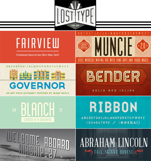
The Lost Type Co-Op is a group of typographers who sell their fonts directly to the customer through their web site, using a pay what you want model. The emphasis is on retro and industrial fonts and typefaces based on mid-twentieth century signage, and they’re awfully nice.
So nice that I’d like them all, in fact.
In most cases, you pay whatever you like for an unrestricted license. In a few cases there are tiers: so much for personal use, so much for commercial use. Licenses for web use as a font-face vary from one to another and are indicated by a distinctive graphic. Lost Type itself just passes the money on to the individual typographers; it doesn’t make any money on its own behalf.
I ran across their site while following a Twitter link that mentioned my Pulp-O-Mizer, and I stayed because, well, I couldn’t help it. There’s some really lovely work here, and the stories behind some of these faces are pretty interesting, too: for example, how a walk through San Francisco’s Mission District led to the creation of Mission Gothic.

 A new page has been published in the story It Came from the PULP-O-MIZER, at Thrilling Tales of the Downright Unusual.
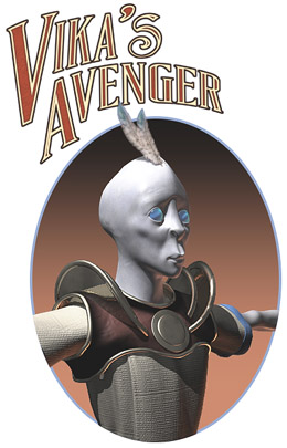 If you want to know what character this is a concept for, you’ll just have to hie yourself over to Lawrence Watt-Evans’ Kickstarter page for his science fantasy novel Vika’s Avenger and then plonk your money down on the table.
If you’re not as ancient as Watt-Evans and I am you may not know that "science fantasy" once described the sort of ray guns and airships adventure stories written by Edgar Rice Burroughs, Otis Adelbert Kline, Henry Kuttner, Leigh Brackett and many other authors; it’s the sub-genre of science fiction that later on led to things with bigger budgets, like that Lucas guy’s movies. It’s science fiction without the problematic physics; and although I like my problematic physics as well as the next guy, I also kind of like big four-armed Tharks scything down their enemies from the backs of their thundering thoats.
The Kickstarter campaign has met its original goal and now, if I’m counting correctly, two of its stretch goals. At least one of those stretch goals turned out to be me.
Yep, I’m happy to say I’ll be doing the cover for the book and – so far – three interior illustrations. Along the way I’m also doing the book design, but that bores you and so I’ll quickly explain that although I am now on board for the book I will be doing more and more illustrations… depending on how much money the project can raise.
So at the moment, we’re looking at the cover (in color) and three interior illustrations. But the project is just $1500 away from its next stretch goal and if it reaches that, well, I’ll be doing even more interior art for the book. That will continue up to some sane limit, so I won’t ever be doing more illustrations than there is text to go with them. Which would be strange.
But for the time being – and until we reach that limit of sanity – more pledges mean more illustrations (by me) and therefore more work (for me) and those are just two of the many reasons why you ought to go drop a dime on Vika’s Avenger at Kickstarter.

 A new page has been published in the story It Came from the PULP-O-MIZER, at Thrilling Tales of the Downright Unusual.
 A new page has been published in the story It Came from the PULP-O-MIZER, at Thrilling Tales of the Downright Unusual.
The facelift is going to continue, with new home page content and a new header across the entire site. In fact I may even rework the underlying HTML so that it’ll be more compatible with some things I may want to add in the future – things that build on the methods I used when I built the Pulp-O-Mizer. But what you’re likely to notice first is the new splash image at the Retropolis home page. If you delve a little deeper you may realize that a lot of merchandise that used to come from the Retropolis Travel Bureau (at Zazzle) is now being sold through the Retropolis Rocket Works (at CafePress). Something similar is going on at my Celtic Art Works site. That’s because recent changes to Zazzle’s policies mean that two things have happened: you’re being charged more for their merchandise, while simultaneously, I make less. It’s a lose-lose situation. Unless your name is "Zazzle", I mean. So I’m taking these steps to get us both a better deal. The new Retropolis Rocket Works merchandise includes coffee mugs, magnets, buttons, mouse pads, and other things that formerly came from Zazzle… at far more attractive prices. I’ve even started by giving those items a pretty low markup, which may or may not continue, depending on what effect that has on sales. (An unfortunate truth about print on demand merchandise is that even with a minimal markup the goods will always be more expensive than mass produced merchandise. So in practice, since one can’t compete on price, it usually works out better to increase the markup.We’ll see how this experiment with lower prices works out. It may be for a limited time only, like they say.) CafePress made fine posters for me for about a decade. A year ago, though, they stopped trimming their posters to size. That means that if you buy an 18×24" poster from them what you get is an 18×24" print in the middle of a much larger sheet. You have to trim it down to size yourself. I don’t think that’s attractive to most buyers, who want to unroll the thing and pin it up, or tape it up, or frame it without having to finish the work themselves. In addition CafePress has a bug at the moment that’s preventing them even from printing the pictures at the correct size. So my posters are still being sold through Zazzle in spite of their draconian price hike. I’m just not sure when or how that’s going to change. But be sure that I’m working on it: I’m looking into other vendors. Since one of my requirements is that I can easily include the merchandise into my own web sites, though, I have a pretty narrow pool to choose from. I’m just glad that when I built these sites I made it relatively simple to swap the merchandise from one vendor to another. I did it once before, and now I’m doing it again. So yay for me, and yay for disaster preparedness! In the meantime, enjoy everything… though maybe not the posters. Coffee mugs, on the other hand, are now priced at one-third off their Zazzle equivalents. Therefore, I suggest that The Answer is Coffee.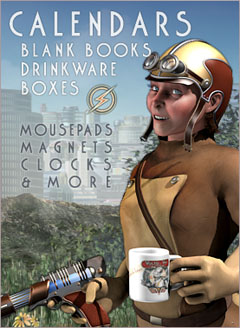 Last week I started some major rework at both Retropolis and The Celtic Art Works. Up to today the changes have been fairly subtle, dealing mainly with what merchandise is available from which vendors. But today I’ve started a facelift at Retropolis, starting out with the home page.
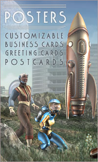 The holdout is posters. The Zazzle price increase, combined with how difficult they make it to change one’s markup, mean that poster prices are much higher right now than I like; and there isn’t an immediate solution.

 A new page has been published in the story It Came from the PULP-O-MIZER, at Thrilling Tales of the Downright Unusual.